Welcome to the website!
Intro Card
Im Jamie Muir, 3rd year Computer Science student at Brock university, and this is my personal little website. i've coded since highschool and it is fun :) creating stuff feels good and plan on showcasing it all here.
Im very into tea, music, seals card games and all things considered "retro" (as you can kinda see by the website...) Everything you would need to know is neatly tucked away on this lil' site. Hopefully getting updated semi frequently!!
Current domain and the holidays
as of the time im writing this ( 16/12/25 12:20am ) I am officially done my fall semester (woohoo!) as a celebration and promise to keep improving this website, I have purchased the domain "jpath.space". Big ups' to my friend Quinn for making that. There is still plenty to do with this website. As you can kinda tell im typing on this page blog-style and I need to change a lot if I want to continue using the site this way. (proper posts with a backend, date and time when I posted something etc.) the backend to this website is coming soon... but it will probably be messy. Whatever thats like the whole reason im making this is to learn and show stuff.
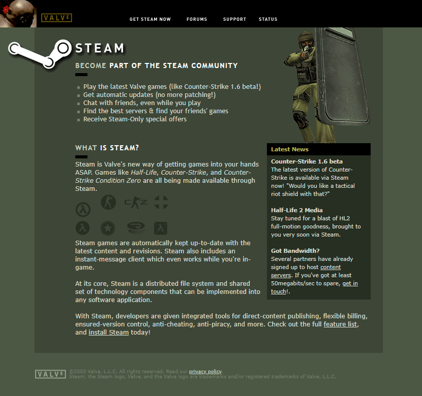
Ohhh yeah, we're doing old school steam theme
you might be wondering what the freak jamie, i thought you were going to do a cool 2000s dreamcast theme! you would never lie to me!!! and thats the secret... i WOULD lie to you... but only because it turns out that is going to take a LOT of work to make that type of website, when i can instead make a classic steam/black-mesa website which is 2x easier and looks 10x better than what i could make otherwise.
like tell me this website isnt the coolest ever heh, i bet all doubters are feeling pretty stupid now!
I have spent a good minute rummaging through old pages, the wayback machine and fan projects to try and make this as close as i can get it (while still being like,,, a good website) so i hope the detail isnt lost on people even if this is actually like in theory one of the easiest websites to make... ;-;
new theme pt. 2
Another reason while im ALREADY changing my website theme (before even getting a domain or finishing the website) is because the old one was built while i was re-learning HTML and CSS so it was messy. starting fresh like this lets me be a lot more surgical with my choices and organized in my files/systems.
Valve is one of my favourite videogame companies, portal, l4d, tf2, etc i feel like im kinda indebted to them, and this is my tribute (because all the money ive spent on steam isnt enough i guess...)
"babe, wake up! new containers just dropped!"
yeahhhh thats right we got multiple colours now. Goodbye to JUST green,, say helloooooo to whites and (more) yellow! i figured this place needed some bright colours to make everything pop. Im happy with how everything looks on the website, especially with how 3d the "sharper" green+darkgreen containers look. Idk if these design choices are actually interesting to talk about but i dont care damn it! i need to fill space on this webpage and im going to do it however *i* please!